Gemini_Generated_Image_1ywzy11ywzy11ywz_1778342065
✅ Positive Prompt
text
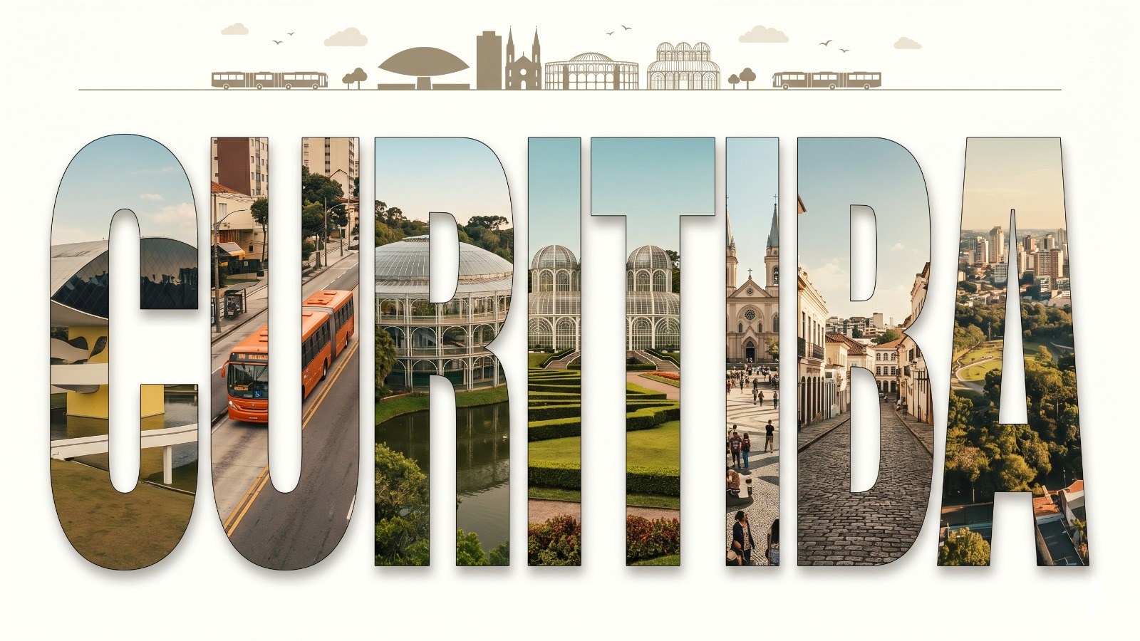
Ultra-high-resolution typography-based travel poster, giant bold sans-serif English word "CIDADE ESCOLHIDA" centered and dominating the composition, each individual letter functioning as a die-cut window revealing photorealistic real photographs of actual locations from CIDADE ESCOLHIDA inside the letter shape,
letter interior content — real photographic scenes clipped inside each letter form:
each letter contains a distinct real location from CIDADE ESCOLHIDA rendered in photorealistic quality — actual architectural photography, real street scenes, genuine landmarks, authentic local environments photographed in natural light, images inside letters feel like real travel photography cropped into letter-shaped frames, scenes transition naturally from letter to letter creating one continuous photographic panorama of the real city,
letter shapes act as precise die-cut masks over real photography: sharp clean letter edges with photorealistic city imagery visible through each letter interior, outside the letters the background is clean white or soft ivory with no imagery,
top horizontal strip: thin panoramic banner at the very top containing minimalist silhouettes of the real city skyline, local transportation, boats if relevant, birds, clouds — elegantly simplified but recognizable as the actual city,
real landmark photography distributed across letters: famous monuments, iconic buildings, characteristic streets, local transportation systems, natural landscape elements, cultural venues, bridges, waterfronts — all actual real locations from CIDADE ESCOLHIDA, each letter showing a different district or landmark of the city,
typography outer shell: bold clean geometric sans-serif letterforms with sharp defined edges serving as the mask frame, slight subtle drop shadow under the letters separating them from the ivory background,
color treatment inside letters: real photography with slight vintage travel poster color grading — warm slightly desaturated tones, soft golden hour light feeling, cohesive color temperature across all letter interiors creating visual unity despite showing different locations,
mood: premium travel editorial, National Geographic meets Taschen photography book, museum gift shop poster quality, sophisticated and wanderlust-inducing,
8K ultra detailed, print-ready, photorealistic letter interiors, perfectly sharp letter edge masks, high-end editorial poster quality,
aspect ratio 16:9
❌ Negative Prompt
text
flat vector illustration inside letters, cartoon scenes inside letters, illustrated landmarks, non-photographic letter interiors, abstract patterns inside letters, empty letters, blank letter interiors, distorted letter shapes, warped typography, broken letterforms, misspelled city name, random symbols, AI gibberish text, non-English text, foreign characters, busy cluttered background, dark background, black background, full image photography without letter mask, photography bleeding outside letter edges, blurry letter edges, soft letter masks, inconsistent photography style between letters, oversaturated colors, neon palette, HDR overprocessed look, watermark, low quality, pixelated edges, faces in foreground, portrait photography, people as main subject, generic stock photo aesthetic, identical scene repeated in multiple letters, missing top panoramic strip
💡 Lighting
text
Natural travel photography lighting inside each letter: warm golden hour sunlight on architectural facades, soft midday diffused light on street scenes, blue hour twilight on skyline elements where relevant, consistent warm slightly desaturated color grading applied uniformly across all letter interiors to create visual cohesion between the different photographic scenes, subtle vignette inside each letter drawing the eye to the center of each photographic panel, outer poster background in clean flat ivory lit evenly like a premium printed surface
📷 Lens & Camera
text
Letter mask treatment: each letter interior simulates a different focal length — wide angle architectural shots for large letters, medium telephoto for detail-rich landmark close-ups, all photography inside letters at sharp focus with natural depth of field, letter edges function as a precise hard crop mask with no feathering or blur at the letter boundary, overall poster rendered at 16:9 aspect ratio as a flat frontal layout with no poster perspective distortion, print-ready maximum resolution output, equivalent to 300 DPI large format print quality
🎨 Style & Detail
text
Photography-inside-typography technique: die-cut letter masking effect where bold geometric sans-serif letters reveal real travel photography of CIDADE ESCOLHIDA through their interior shapes, each letter showcases a different iconic real location — distribute landmarks, neighborhoods, transportation, nature and architecture across the full city name ensuring no two letters show the same location or scene type, photography color graded with a cohesive warm vintage travel tone: slight desaturation, lifted shadows, warm highlights, reminiscent of high-end travel magazine photography from Condé Nast Traveler or Monocle, top strip silhouettes echo the real skyline of CIDADE ESCOLHIDA in simplified elegant form, city name spelled correctly in full as CIDADE ESCOLHIDA, overall poster composition feels like a premium limited-edition travel print combining the graphic power of bold typography with the emotional authenticity of real destination photography, suitable for airport gallery installation, luxury hotel lobby art, or museum travel exhibition
⚙️ Nano Banana Settings
Parâmetro Valor
Parâmetro Valor
Ratio 16:9
Style Photography / Editorial Design
Steps 45–50
CFG Scale 8–10
Sampler DPM++ 2M Karras
Image Reference Opcional: fotos reais da cidade
Face Reference Não aplicável