Gemini_Generated_Image_loutseloutselout_1777145659
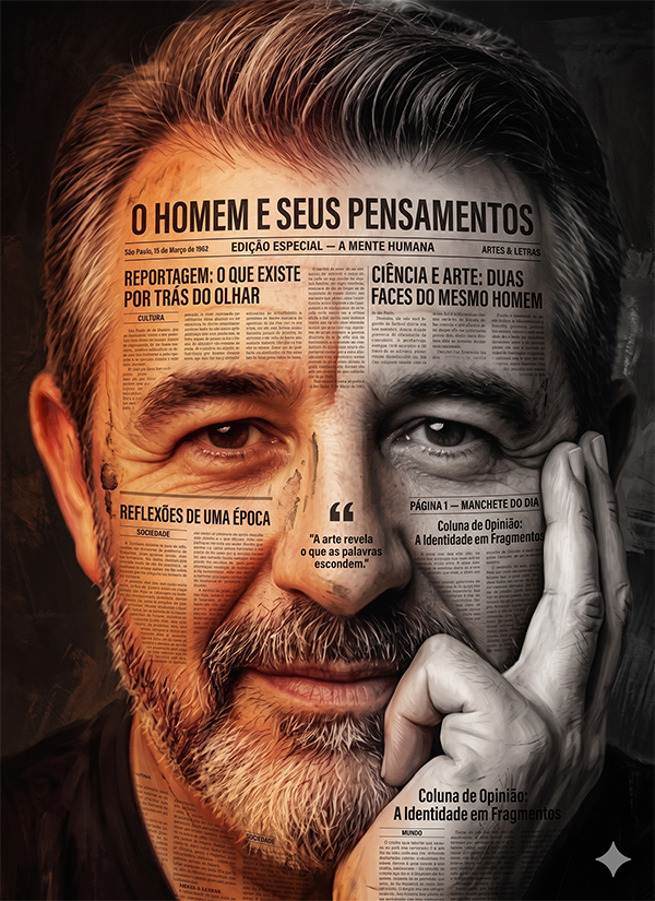
A hyper-detailed digital painting portrait of a man with a thoughtful expression, resting
his face on his hand, close-up composition. The artwork blends realism with painterly
brush strokes and collage elements.
[TIPOGRAFIA & TEXTURA DE JORNAL — PORTUGUÊS DO BRASIL]
His face is partially overlaid with vintage Brazilian newspaper and magazine textures,
with headlines, body text, and typography fully integrated into the skin surface as if
printed directly onto flesh. All text visible in the image must be written exclusively
in Brazilian Portuguese. Examples of visible headline text integrated into the skin:
- "O HOMEM E SEUS PENSAMENTOS"
- "EDIÇÃO ESPECIAL — A MENTE HUMANA"
- "REPORTAGEM: O QUE EXISTE POR TRÁS DO OLHAR"
- "CIÊNCIA E ARTE: DUAS FACES DO MESMO HOMEM"
- "REFLEXÕES DE UMA ÉPOCA"
- "PÁGINA 1 — MANCHETE DO DIA"
- "Coluna de Opinião: A Identidade em Fragmentos"
- Small body text columns in Portuguese running across cheekbones, forehead, and jaw —
dense newsprint paragraph text, justified columns, vintage serif typeface typical of
Brazilian broadsheet newspapers (similar to Folha de S.Paulo, O Globo, Jornal do Brasil)
- Date stamps in Portuguese format: "São Paulo, 15 de Março de 1962"
- Section headers: "CULTURA", "SOCIEDADE", "ARTES & LETRAS", "MUNDO"
- Page numbers: "Pág. 3", "Nº 1.847"
- Pull quotes in italic serif: "A arte revela o que as palavras escondem."
- Caption text under imaginary photo zones: "O retrato de uma geração em transformação"
Typography style: aged Brazilian broadsheet newsprint — yellowed, slightly worn, with
ink bleed and uneven ink saturation typical of mid-20th century letterpress printing.
Some text areas show deliberate wear, foxing spots, and fold crease lines.
Magazine glossy insert sections mixed with matte newsprint sections.
[COLOR & LIGHTING]
Warm tones — reds, oranges, burnt sienna — dominate the left side of the face,
illuminating the newspaper texture with a warm amber glow that makes the ink appear
golden and aged. Cool desaturated tones — grays, whites, muted blues — dominate the
right side, making the newsprint appear colder, more clinical, monochromatic.
Split-tone effect creates a dramatic visual divide across the centerline of the face.
Strong emphasis on expressive, deeply rendered eyes — the one window of the face
free from newspaper overlay, showing pure skin texture and emotional depth.
Detailed skin texture visible between and beneath the newspaper layers.
Subtle, well-defined facial hair rendered with individual strand detail.
[STYLE]
Artistic mixed-media style combining hyper-realistic portrait painting with graphic design
and collage. Visible painterly brush strokes in background and transitional areas.
High contrast cinematic lighting. Sharp focus on eyes and central facial features.
Background: dark, abstract, slightly textured — supporting the face without competing.
4K resolution. No English text anywhere in the image. All typography exclusively in
Brazilian Portuguese.
❌ NEGATIVE PROMPT
text
English text, Spanish text, French text, any non-Portuguese language typography,
Latin placeholder text (lorem ipsum), illegible fake newspaper text, invented alphabet,
modern sans-serif fonts on newspaper sections, digital screen fonts, clean modern layout,
blank or text-free newspaper texture, generic grunge texture without readable text,
flat 2D collage look without depth integration, plastic skin, CGI render artifacts,
overexposed highlights, blown-out skin, neon colors, overly saturated palette,
missing newspaper overlay, uniform single-tone lighting (must have split-tone),
watermark, logo, signature, low resolution, compression artifacts.
💡 LIGHTING
text
Split lighting setup — hard diagonal division across the vertical center of the face:
LEFT SIDE — warm key light: strong amber-orange practical source from upper left,
color temperature 3200K, casting deep warm shadows that saturate the newsprint ink
with golden-red tones, making headlines glow with heat.
RIGHT SIDE — cool diffused fill: soft desaturated grey-white light, almost overcast
quality, draining color from the newsprint and skin, reducing to monochromatic tones.
Eyes: both eyes receive a sharp catchlight — one warm gold, one cool silver —
reinforcing the split-tone duality.
Background: near-black with subtle warm gradient on the left bleeding into cold grey
on the right, mirroring the face's tonal split.
📷 CAMERA & LENS
text
Camera: Hasselblad H6D-400c
Lens: 85mm portrait prime — natural compression, no distortion
Aperture: f/2.8 — eyes and central face tack-sharp, ears and background in soft bokeh
Close-up composition: face fills 80% of frame, chin slightly cropped at bottom,
forehead with slight space at top
Hand supporting face visible from lower frame edge — fingers showing newsprint
texture transfer onto skin
4K resolution — maximum micro-detail on typography and skin texture
🎨 STYLE DETAILS
text
Newspaper era reference: Brazilian press aesthetic from 1940s–1970s
Typefaces: classic Brazilian broadsheet serifs — reminiscent of Bodoni, Times,
and Century Schoolbook as used in Folha de S.Paulo and O Globo historical editions
Paper texture: yellowed aged newsprint with foxing spots, ink bleed halos around
letterforms, uneven ink density — authentic letterpress character
Magazine inserts: occasional glossy magazine clipping fragments with colored ink
and bolder Brazilian magazine typography (similar to Manchete, Cruzeiro, Veja)
Overall: hyper-detailed 4K digital painting. Painterly in brushwork but photorealistic
in skin and typography rendering. Cinematic. Emotionally charged. No English. No logos.